Are you excluding employees with Dyslexia?
10% or more of your people probably have Dyslexia, and making it easy for them to take part in surveys should be part of your decision-making process when choosing who to work with and how you create surveys and communications.
What is Dyslexia?
"Dyslexia is a neurological difference and can have a significant impact during education, in the workplace and in everyday life.
As each person is unique, so is everyone’s experience of dyslexia. It can range from mild to severe, and it can co-occur with other learning differences. It usually runs in families and is a life-long condition." (The British Dyslexia Association)
Here are my top tips for designing for people with Dyslexia!
Do not use serif fonts!
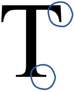
Serifs are those bits that hang off letters, you will see them on fonts like Times New Roman, Georgia, Garamond, Bodini and Rockwell.
The impact of this for someone with dyslexia is that they tend to obscure the shape of the letter and make letters appear to run together.
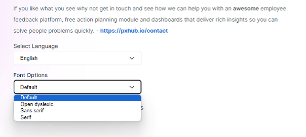
So using Sans Serif fonts (sans means ‘without’) should be your default position; examples are Ariel, Calibri, Comic Sans (yes, you hate it, but it is a fab font for people with dyslexia), Century Gothic, Gill Sans and Helvetica.
Or there are a number of fonts that have been designed with Dyslexia in mind; here at The People Experience Hub, we let users completing surveys select the font they prefer, and we include Open Dyslexic as a font choice.
Do not use Justified Text or Double Spacing after a full stop
The river effect is where there are rivers of white space in the body of text, which can cause people with dyslexia to lose their place when reading.
Justified text is where you distribute your text evenly across a fixed area. It is often used for formal documents and often seen in legal contracts, academic papers and in places where the writer is portraying a more formal message.
The text below is an example of this:
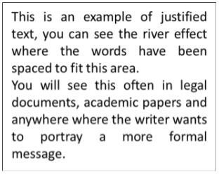
Double Spacing after a full stop creates the same effect.
So, when designing your survey and communications, think about how someone with dyslexia will participate, and is there anything more you can do to help them?
Some People are Colourblind
8% of Males and 0.5% of Females are colourblind (around 4.5% on average globally) and so am I.
The best thing about being colourblind is when people start holding up different coloured things and ask me, “What colour is this?” and it is all a bit of fun…right up until the point that I am excluded or made to feel embarrassed by something like the Red Amber Green heatmap.
Time to Bin the RAG Report
If you use red and green to show a difference on a dashboard, a chart, a notice board, a poster, etc. then you are effectively stopping people with colour blindness from taking part in this conversation, or at the very least making it more difficult than it needs to be.
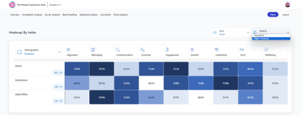
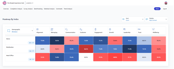
I see these most in survey providers for things like Heatmaps, so what do I see?
The top image is hot you see the report, and the bottom image is how I see it:
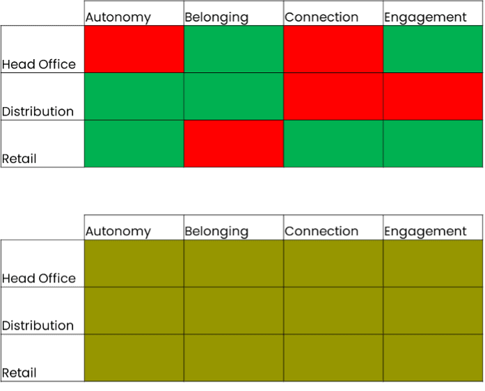
It is really simple to fix this!
The image below shows our heatmaps. you will see that they are by default monochromatic (which means a colour scale using one colour), but they also allow people to select a High Contrast View
The high contrast view is not Red and Green; rather, it is Blue and Red as these are very different colours, so still colourblind friendly!
Using Multiple Language Options
Not everyone has English as their first language, and supporting people with multiple language choices just makes sense.
It is super easy to ensure that people can take part in the language they find easiest, and technology has made this a standard in many tools.
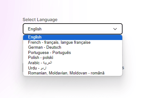
Additional features like adapting to the browser setting is cool, it means that if you have a translation and your employees have their browser set to say Portuguese then the survey will open in Portuguese. (This is a People Experience Hub feature, but anyone can do this!)
Deskless Workers
Not everyone in your business will have a desk or, for that matter, a work email address. So, different ways of reaching this group are really important in your survey technology.
Apps are not the answer - I am putting this here because we get asked several times if we have an app (a downloadable app), and the answer is no. Our product can be used on ANY device that can access the internet, and that is far more inclusive! (Also, it is not 1994)
We use a number of solutions to reach our Deskless workers, including:
- QR Codes on posters
- Integrating with other systems (Employee Benefits Platforms, Payroll and HR Systems, Learning Tech and Intranets) to share the survey
- Standard URLs to access the platform
- Communication Session for all
- Putting Kiosks on site
We see organisations with Deskless Workers achieving 85% to 95% participation - No email? No problem!
It is a Journey
and that journey starts with you being intentional in being inclusive!
When we started The People Experience Hub I knew that whatever we did, we needed to be as inclusive as possible.
I am lucky to work with a great team on our product development, and everyone is a huge advocate of the technology user experience being an inclusive one.
We hold each other to account, and when one of us comes up with something amazing, we use a set of UX tools to test this idea against and of course, inclusion is one of these tests.
We know that we are on a journey, and not everything we do will be perfect, but we will continue to strive to be better and make it happen!
There is a lot to take in here, and if you are making changes internally, it can feel a little overwhelming; my advice to you is that you have started, and that is the main thing, but also lean on your tech suppliers and demand better from them for your people and ask them how they tackle the above.
And remember to listen to your people and let them tell you if something isn’t working.
Fancy seeing the accessibility features on our platform? Book a demo