A blog on being accessible and inclusive (first of many)
How people experience works is not a standard, one size does not fit all and if it is designed without considering the rich and wonderful variations that people bring with them then you are going to be delivering a reduced experience.
This blog is about how technology plays a part in this experience design and how it can remove barriers but also what you can do differently for the group of people that experience colour blindness.
How common is colour blindness?
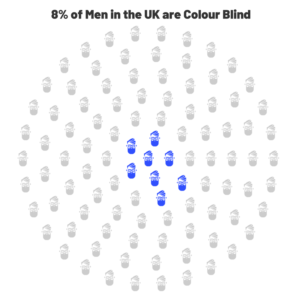
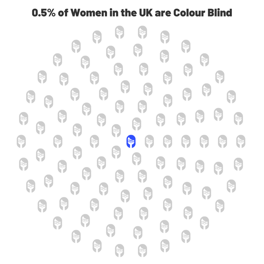
In the UK there are 3 million colour blind people, so 4.5% of the overall population.
Men are more likely to experience colour blindness: - 1 in 12 (8%) of men and 1 in 200 (0.5%) of women are colour blind.
So, as an employer of people, or a provider of technology to them, it is likely that you will need to consider colour blindness in design.
I am one of the 8% of men who are colour blind and with the above, in mind, the fact that I work for a tech company and that I also spend lots of time discussing people analytics, people feedback and data visualisation, I would like to talk about a few things on this blog:
- The things you could be doing that potentially exclude a population of your workforce
- How tech should be helping and what you should be asking from your tech partners
- How this is a journey for all of us and it starts with the intention to solve stuff for people.
Your KPI report is not inclusive (Sorry)
Hi, my name is Nick and my colour blindness means I mainly struggle with reds and greens, but also blues / purples and greens / browns, which is lovely, I can never be a commercial airline pilot.
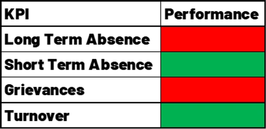
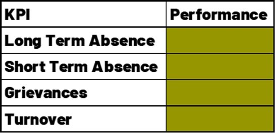
So, now imagine me in HR, flying those HR key performance indicators (KPI’s) that are flagged as Red (Under-performing), Amber (Underperforming a bit) and Green (On target) – commonly called a RAG report (Red, Amber, Green)
If you use red and green to show a difference on a dashboard, a chart, a notice board, a poster etc then you are effectively stopping me taking part in this conversation, or at least making it more difficult than it needs to be.
What do I see? (i hear you ask)
You see the problem?
Heatmaps and RAG charts are problematic
A heatmap is a really good way of presenting large data sets where you want to show high, low and in-between results.
At The People Experience Hub, we use them in our dashboards, and we opt for a monochrome (one colour) scale in blue (I like blue) as this is good practice for ensuring that we do not exclude colour blind people from our tech.
We are often asked if it would be possible to have the low numbers in red and the high numbers in green, another example of how a traffic light system has become a norm, and when this happens we always try to educate on how this would cause issues for a population of workers.
I have recreated a red/green heatmap and a monochromatic heatmap below so you can see the difference it makes, the red/green one confuses me and I am not sure what is red and what is green here but the blue one is crystal clear.
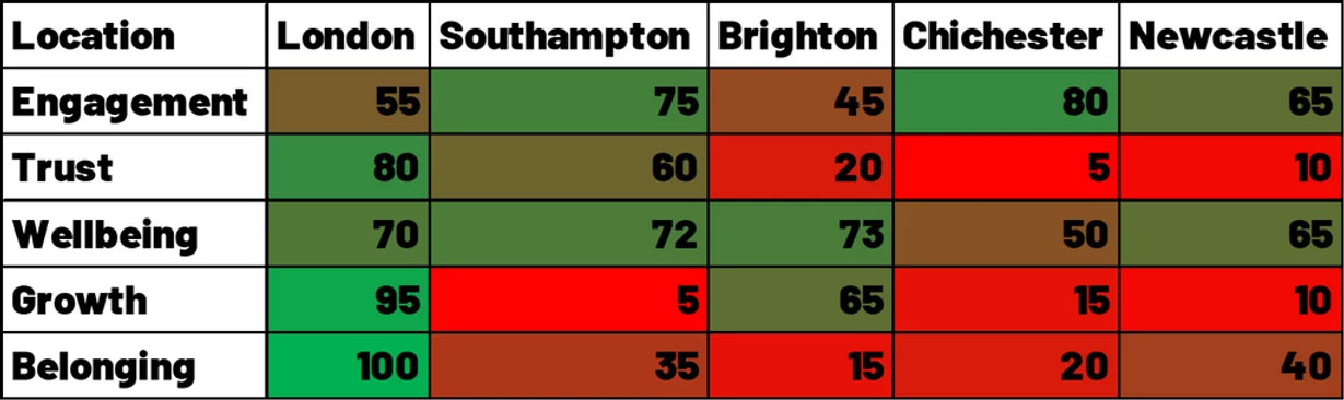
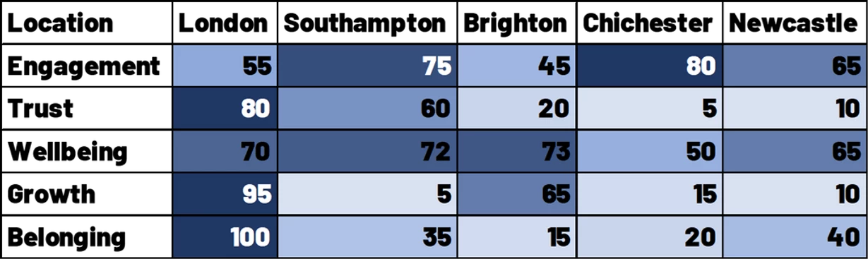
Traffic light systems of reporting data have become so normal it is the default for many companies reporting.
It should stop. Please.
What colours can I use when designing for colour blindess?
I am glad you asked!
Martin Krzywinski, Scientist, Data visualisation wizard and all-round inclusion good human has developed a 15 colour palette for colour blindness.
Details in the link and image below:
http://mkweb.bcgsc.ca/colorblind
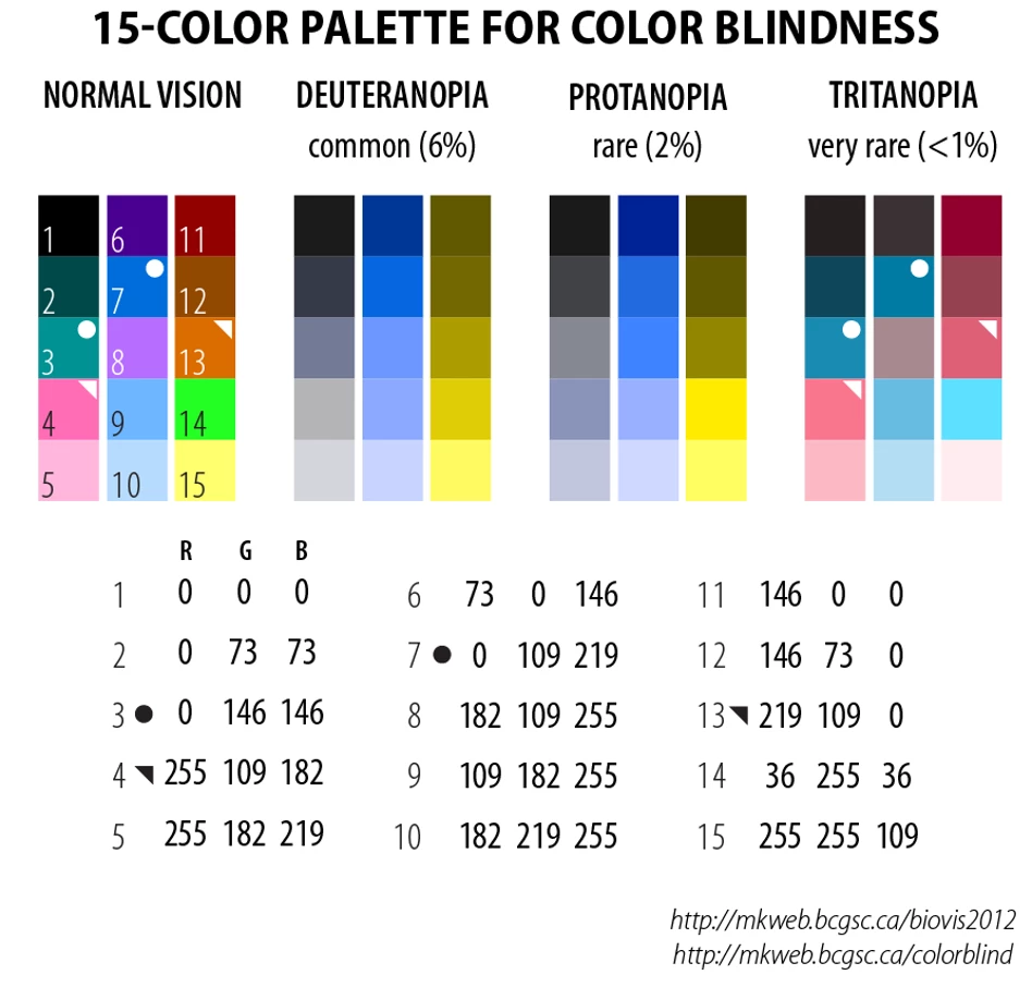
This 15-colour palette provides good discrimination for common colour blindness types.
Individuals with tritanopia cannot distinguish colours marked with ● and ◥.
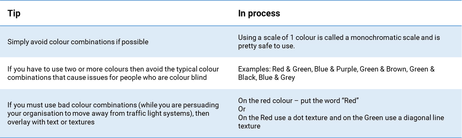
Top tips for colour blind data visualisations
We have summarised some top tips for ensuring that what you are doing is accessible for people who are colour blind
…and while we are here, chromostereopsis
Not directly related to colour blindness, but blooming annoying for lots of people!
If you put blue and red next to each other it can cause an optical illusion of depth, normally the red section is seen floating, for me I see it moving around which is a bit weird, and this is called chromostereopsis.
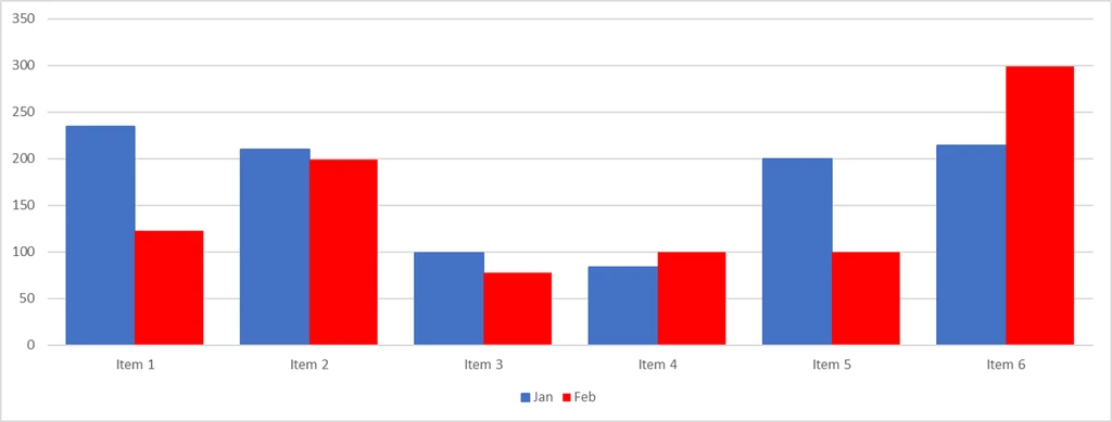
One of the issues here is a lot of tools default to a red and blue image, Microsoft Excel will default to the chart colours below – some people will see some crazy stuff here!
But there is a simple solution to this one – just stop using red and blue next to each other.
Remember it is a journey
When we started The People Experience Hub I knew that whatever we did we needed to be inclusive.
I am lucky to work with a great team on our product development and everyone is a huge advocate of the technology user experience (Ux) being an inclusive one.
We hold each other to account and when one of us comes up with something amazing we use a set of UX tools to test this idea against and of course inclusion is one of these tests.
We know that we are on a journey and not everything we do will be perfect, but we will continue to strive to be better and make it happen!
There is a lot to take in here and if you are making changes internally it can feel a little overwhelming, my advice to you is that you have started and that is the main thing but also lean on your tech suppliers and demand better from them for your people and ask them how they tackle the above.
And remember to listen to your people and let them tell you if something isn’t working.
Measuring the experience
At The People Experience Hub our whole range of tools help you understand the inputs, what detracts from satisfaction and to really understand what changes can be made to improve people experience by design
“Designing a great people experience for your employees starts with understanding how they feel about the world of work from start to finish.