A blog on being accessible and inclusive.
How people experience works is not a standard, one size does not fit all, and if it is designed without considering the rich and wonderful variations that people bring with them then you are going to be delivering a reduced experience.
This blog is one of a series of blogs about how technology plays a part in this experience design and how it can remove barriers but also what you can do differently to include neurodiverse groups. You can read the first, on Colour Blindness here
Dyslexia is a very common form of neurodiversity 10% of the UK population has some form of Dyslexia – that is a whopping 6.3 million people So, as an employer of people, there is a pretty high chance that some of your people are dyslexic.

Is your tech Dyslexia friendly?
…Are your written communications?
How you choose to use technology and how you communicate in your business will matter to any of your workforce with dyslexia. (Remember 10% of the UK have Dyslexia and this could be higher!)
So, what is Dyslexia?
The British Dyslexia Association say this:
"Dyslexia is a neurological difference and can have a significant impact during education, in the workplace and in everyday life.
As each person is unique, so is everyone’s experience of dyslexia. It can range from mild to severe, and it can co-occur with other learning differences.
It usually runs in families and is a life-long condition."
Tips for dyslexia-friendly text
In our business we are in the business of asking people what they think, we do this typically with text, so it makes sense to ensure that we are not putting a barrier in the way of people with dyslexia.
Do not use serif fonts!
Serif fonts examples are Times New Roman, Georgia, Garamond, Bodini and Rockwell.
A serif is the bits circled in the image here:

The impact of this for someone with dyslexia is that they tend to obscure the shape of the letter and make letters appear to run together.
So using Sans Serif fonts (sans means ‘without’) should be your default position, examples are Ariel, Calibri, Comic Sans (yes you hate it, but it is a fab font for people with dyslexia), Century Gothic, Gill Sans and Helvetica.
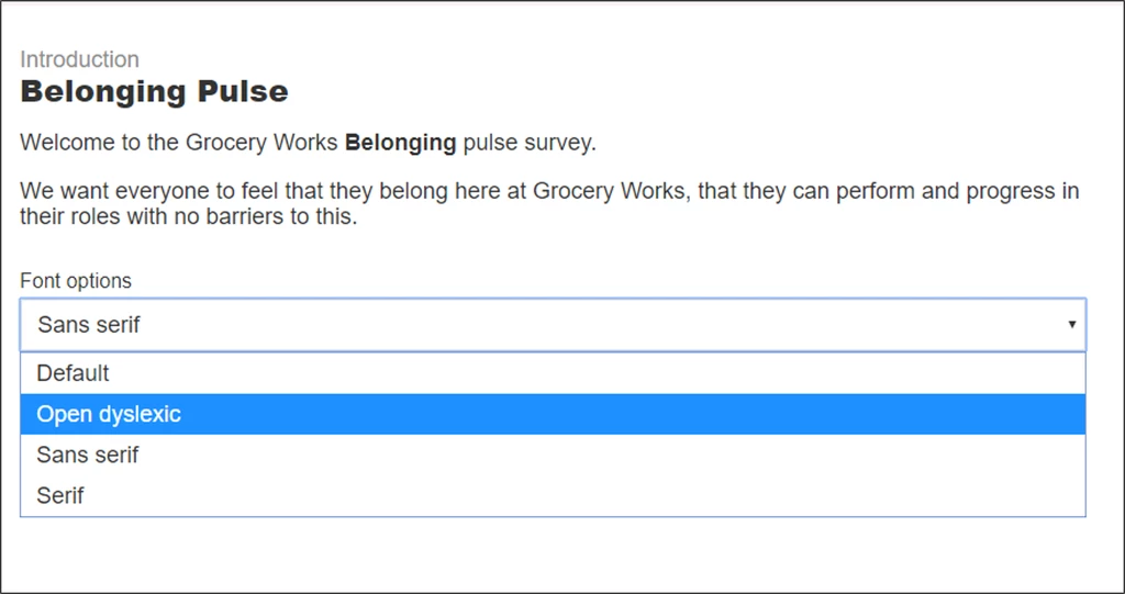
Or there are a number of fonts that have been designed with Dyslexia in mind, here at The People Experience Hub we let users completing surveys select the font they prefer and we include Open dyslexic as a font choice.
Use bold text not italic or underlining to highlight words Italic text and Underlined text will make it harder to read for anyone with dyslexia, if you need to highlight an important section then make the text bold instead.
Do not use justified text or a double space after a full stop The river effect is where there are rivers of white space in the body of text, which can cause people with dyslexia to lose their place when reading.
Justified text is where you distribute your text evenly across a fixed area. It is often used for formal documents and often seen in legal contracts, academic papers and in places where the writer is portraying a more formal message.
The text below is an example of this:

Double Spacing after a full stop creates the same effect.
Sorry to all those, like me, who were raised to use a typewriter and always to put a double space after a full stop but the time has come for us to try and stop this practice.
Back in the day, a double space accentuated the end of a sentence when using a typewriter because they used single-spaced letters.
Today this practice used online (and offline) causes the river effect and will make your text difficult to read for anyone with Dyslexia.
We ran a quick Twitter poll, which you can find here asking people if they put a double space after a full stop and 34% of people said that they did.
We are always learning and breaking a habit is hard so people may need your support in understanding the impact today.
Colour is important
Stay away from using stark contrast (bright white background and pitch-black fonts) as this can be a little overwhelming, soften the background slightly and use a dark grey rather than a solid black for your text.
Avoid background patterns and pictures, use a solid colour instead. You can find out some more about dyslexia-friendly styles here.
Let technology do the heavy lifting
As with any communication it is all about the right delivery, whether that is multiple channels you should make sure that there are options for as many people as possible.
Today stuff like letting users select the font they read and complete a survey in should be the basics.
But also can a screen reader cope with the layout on the screen?
Getting these basics right should come before any funky functionality.
Remember, becoming inclusive is a journey!
When we started The People Experience Hub I knew that whatever we did we needed to be inclusive.
I am lucky to work with a great team on our product development, and everyone is a huge advocate of the technology user experience (Ux) being an inclusive one.
We hold each other to account and when one of us comes up with something amazing we use a set of UX tools to test this idea against and of course inclusion is one of these tests.
We know that we are on a journey and not everything we do will be perfect, but we will continue to strive to be better and make it happen!
There is a lot to take in here, and if you are making changes internally it can feel a little overwhelming, my advice to you is that you have started and that is the main thing but also lean on your tech suppliers and demand better from them for your people and ask them how they tackle the above.
And remember to listen to your people, let them tell you if something isn’t working.
Thank you for reading!
Why not check out our blog on Belonging which can be found here